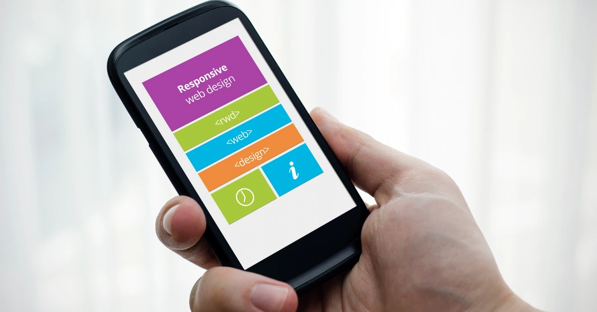
Web design today goes beyond aesthetic appeal; it is now about how the website looks on all devices. In today’s world dominated by mobile phones, being in Chicago with crowded competition makes mobile responsive web design a necessity. It’s a given that a responsive site changes to fit diverse screen sizes, but it also adjusts to provide quicker loading times, more straightforward navigation, and improved user interaction. If your mobile web design is unattended, there are potential customers who you are going to lose because they won’t even look at your products and services.
What is Mobile Responsive Web Design?
A mobile responsive website will change its layout, images, and functionalities accordingly and look beautiful on any device, be it desktops, tablets, or smartphones.
Simply “shrinking” your desktop website to fit a phone screen does not classify as responsiveness. Proper responsiveness requires the following:
- Text can be read clearly without zooming
- Navigation is easy and thumb-friendly
- Pages load fast on mobile data connections
Given that 90% or more of the population of Chicago owns a smartphone, mobile responsiveness is a must.
Why Mobile-Responsiveness is Important For Chicago Clients
1. Chicagoans Are Always On-The-Go
From El to Metra, commuting, grabbing coffee, or almost anything else, life in Chicago sure seems busy!
- Because if your site doesn’t load properly on a phone, most users won’t even bother coming back.
- Studies show that mobile users abandon sites that take longer than 3 seconds to load.
- Every millisecond **and** millimeter is critical when it comes to mobile responsiveness.
2. Google Prioritizes Mobile-Friendly Sites
Mobile-first indexed websites have been used by Google since 2019.
This means that Google now looks at the mobile version of a site first before deciding how high you rank in search results.
- If your business site is not mobile-optimized, this happens:
- Is your Chicago business site not getting mobile-optimized?
- Your SEO rankings suffer. You appear lower in local searches. Competitors with mobile-friendly sites leapfrog over you.
If you want to appear on searches like “best Chicago law firm” or “boutique in River North,” you need to have a mobile responsive site.
3. Mobile Traffic Dominates
As of 2024, the number of mobile device users is expected to make up over 65% of all website traffic. That number is even higher in urban areas like Chicago, where people multitask and use phones extensively. Without a responsive site, which can be viewed as a mobile-friendly site, you’re essentially ignoring more than half of your potential market.
- This is hardly a strategy any business in Chicago should consider.
- The Risks Associated with Mobile-Responsive Design.
- Responsive design boosts customer engagement and decreases bounce rate.
- Mobile, or responsive web design, keeps users on a webpage for longer.
Users who can seamlessly navigate a website…
- …Check additional pages
- …Browse services
- …Fill in inquiry forms
- …Conduct Purchases
…and more.
By contrast, Google — and customers — interpret a business website that hinders simple navigation as clunky and not user-friendly, which inflates bounce rate.
Increased Conversion Rates.
Businesses in Chicago have reported significant upticks in conversion rates for mobile-optimized design websites. Implementing changes such as simplifying table reservations, quote applications, or product purchases results in heightened income.
Enhanced Brand Perception
Your website is your brand’s first handshake.
In a city as competitive as Chicago, where brands fight for every inch of market share, your digital presence must wow.
A modern, mobile-responsive site says:
- You’re professional
- You’re customer-focused
- You’re trustworthy
An outdated, non-mobile site says the opposite.
Standard Features of Mobile-Responsive Web Design
At Wowww Agency, we design with Chicago’s mobile users in mind.
Key features we incorporate include:
- Responsive menus: Easy-to-use, mobile-friendly navigation
- Fast loading times: Optimized images and clean code for quick browsing
- Touch-friendly buttons: No more tiny links — easy-to-tap calls-to-action
- Minimalist design: Clear, distraction-free layouts for smaller screens
- Click-to-call functionality: Perfect for service-based businesses
- Location integration: Google Maps embeds and “directions” buttons for quick access
What Happens If You Ignore Mobile Optimization?
In short:
You lose customers. You lose credibility. You lose revenue.
Non-mobile-friendly sites frustrate users, kill SEO performance, and hurt your brand’s reputation.
In Chicago’s hyper-competitive market, where choices are abundant, customers won’t hesitate to choose a business that offers a better digital experience.
Make Your Website Work for Chicago’s Mobile World
Today, mobile-responsive design isn’t a luxury — it’s a requirement for serious Chicago businesses.
A responsive website:
- Enhances user experience
- Strengthens your brand
- Improves SEO rankings
- Increases conversions
- Future-proofs your growth
At Wowww Agency, we specialize in building mobile-optimized websites that turn visitors into loyal customers.
If you want your business to thrive in Chicago’s fast-paced digital world, let’s design something amazing together. Contact Wowww Agency today for a free web design consultation.


Share